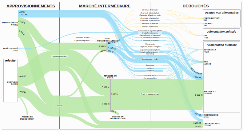
The flow diagram presenting the results for this supply chain, produced as part of the SOCLE project, offers a complete view of how material circulates through the chain, from supplies to final outlets. It is a Sankey-type representation: the thickness of the arrows is proportional to the quantities (in kilotonnes, kt), making it possible to grasp at a glance the relative weight of each segment.
This diagram aims to represent the supply chain as a whole at the most detailed level possible. Although some data could be mobilised at a finer level of detail than the one shown, it did not make it possible to guarantee complete data all along the chain: such data is therefore shown in aggregated form on the diagram.
The diagram represents all the material flows within the fruit and vegetables supply chain in France, from supply sources to the various final uses, for the 3 years studied in the SOCLE project: 2015, 2019 and 2023 (select the desired year in the timeline below the diagram).
Supplies include imports and the agricultural production of fruit and vegetables, distinguishing the different crop categories and the losses occurring right from the production stage. The intermediate market splits between the fresh market, which directly feeds final consumption, and primary processing and agri-food processing activities. This part highlights the diversity of processed products (canned, frozen, juices, prepared products) as well as the generation of co-products and sorting rejects. The outlets bring together human food, animal feed, non-food uses and exports. The diagram also highlights downstream losses and statistical discrepancies, providing an overall view of the recovery routes and potential inefficiencies of the system.
The relative thickness of the flows highlights the predominant role of the fresh market, the significant place of processed products and the importance of losses and co-products in the overall balance of the chain.